


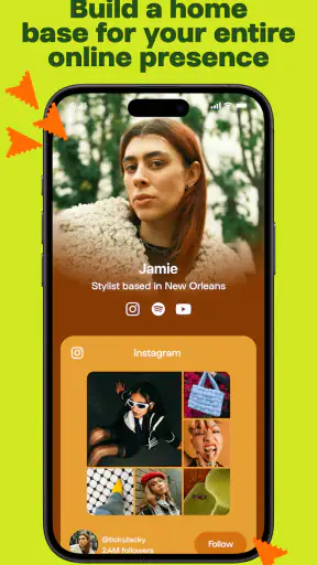
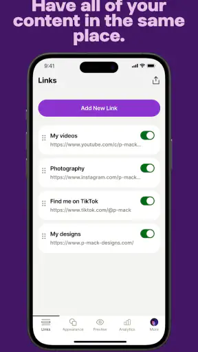
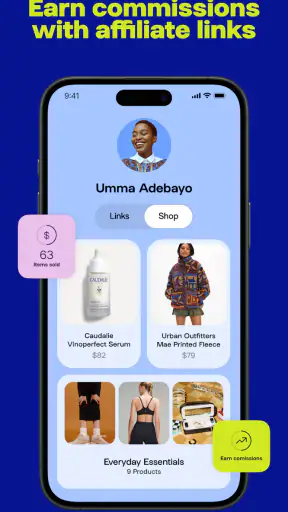
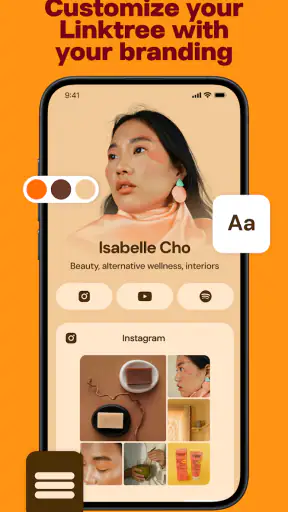
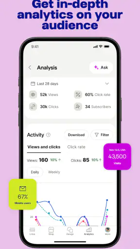
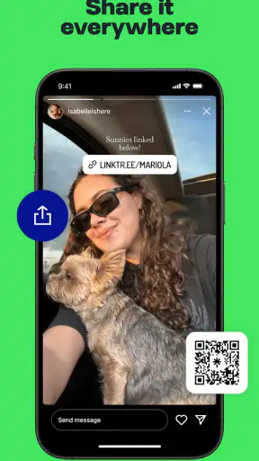
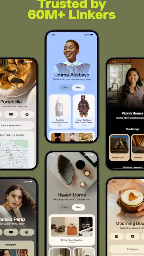
I use Linktree as a simple way to turn one profile address into a useful starting point for everything I want people to find. Its main capability is straightforward but genuinely practical: I can gather several destinations behind one shareable page instead of choosing only one link for a social profile. That makes it especially relevant for creators, freelancers, small businesses, community organizers, and anyone whose online identity is spread across several services.
The app belongs to the social category and is developed by Linktree. It is free to install, rated for Everyone, and available on Android devices running version 7.0 or later. The current release is 3.57.0, and the app has passed the one-million-install mark. Those details matter because this is not a niche experiment; it is an established tool built around a very specific everyday problem: what to do when a profile gives you only one place for a link but your audience needs several.
One page that gives a profile more room
The appeal becomes clear when I imagine updating a social profile. I might want visitors to see my portfolio, newsletter, shop, latest video, booking page, and contact option. A normal profile link usually forces me to pick one destination, while Linktree lets me present those destinations together on a single landing page. The result is less about creating a full website and more about creating a focused directory for people who already found me somewhere else.
That distinction is important. I would not treat it as a replacement for a complete website, online store, or professional portfolio. It works best as the layer between an audience and the places where my work actually lives. The page gives visitors a clear route forward, while the individual services continue handling purchases, publishing, bookings, subscriptions, or conversations.
In my experience, the strongest benefit is not simply having multiple buttons. It is controlling the order in which people encounter my online presence. The first link can point to the action I care about most, while secondary links remain available without competing for attention in a profile description. That small amount of structure can make a scattered online identity feel much more intentional.
The app’s store rating is 4.6 from roughly sixty-one thousand ratings, with about one thousand two hundred written reviews. I see that as a useful sign of broad appeal, although popularity does not remove the need to set the page up thoughtfully. A poorly arranged collection of links can still feel confusing, even when the tool itself is easy to use.
Building a useful page instead of a link pile
The first practical decision is deciding what the page is for. If I am a photographer, the page might lead with a current booking option, then show a portfolio, recent work, and an email contact. If I am a musician, I might put the newest release first, followed by listening destinations, live information, and social profiles. If I am a local group, the priority could be an event page, sign-up form, community channel, and directions.
I find it helpful to think in terms of visitor questions rather than personal categories. What does a new visitor need first? What should a returning follower reach quickly? Which link is temporary, and which ones deserve a permanent place? This approach prevents the page from becoming a dump of every account I have ever created.
A useful workflow is to keep the top of the page focused on one current goal. I can then place stable identity links below it. For example, a limited-time registration or new project can lead, while my portfolio and contact details remain available underneath. When the temporary priority changes, I only need to adjust the prominent destination rather than rewrite every social profile.
That is one of the less obvious strengths of a link-in-bio tool: it reduces the number of places I have to edit when my priorities change. Instead of repeatedly replacing a profile link across different networks, I can preserve the same central address and update the page behind it. For anyone promoting frequent releases, events, campaigns, or appointments, that can make routine maintenance much less irritating.
How the experience works for the visitor
From the visitor’s side, the page needs to answer a simple question quickly: where should I go next? Clear labels matter more than clever wording. “Book a session,” “Read the latest article,” or “See the full portfolio” tells me more than a vague label such as “My links.” I would also keep the number of choices under control, especially near the top.
This is where Linktree’s convenience can become a weakness if I use it without editing discipline. Adding every destination may feel thorough, but it shifts the decision-making burden to the visitor. A person arriving from a short social post may only have a few seconds of attention. If the page presents too many equally weighted options, the central purpose gets lost.
I also recommend checking the page as a stranger would. I would open it from a phone, start at the top, and ask whether the most important action is obvious without explanation. I would test the links I use most often and remove old campaigns, duplicate profiles, and destinations that no longer represent my work. The app makes gathering links easier; it does not automatically make the selection good.
Another practical consideration is consistency. If my profile name, visual style, and wording change dramatically from one service to another, the Linktree page can expose that inconsistency rather than solve it. I get better results when the page acts as a calm, recognizable hub: one clear identity, a short explanation, and links arranged by visitor value.
A realistic everyday scenario
Imagine I run a small food business and use several social accounts to share recipes and behind-the-scenes clips. I also take weekend orders through a separate form, publish a menu, collect email subscribers, and post pickup information elsewhere. A potential customer discovers one of my videos and taps the profile link. Without a central page, I would have to choose between the menu, the order form, or the newsletter. With Linktree, I can place the current menu and ordering option first, then keep the newsletter and social channels available below.
The important effect is not that the customer sees more links. It is that the customer reaches the right next step without searching through old posts. If the menu changes, I update the destination in one central place. If ordering closes for the weekend, I can change the priority without changing the address printed on packaging or used in profiles.
I would use the same logic for a job seeker sharing work samples. A portfolio can lead, while a résumé, professional profile, contact method, and selected project pages follow. For a teacher or coach, the page could guide visitors toward scheduling, resources, and a community space. These examples work because each audience arrives with a clear intention, and the page helps them act on it.
Where it fits beside the usual alternatives
The usual alternative is to place one direct link in a profile and change it whenever a new priority appears. That method is perfectly fine for someone with one destination or a very occasional update. It is also more immediate: the visitor lands exactly where I send them, with no intermediate page. If I only need to promote one article this week, a direct link may be the cleaner choice.
A full website offers more control over branding, navigation, search visibility, content structure, and customer journeys. I would choose a website when the link page is becoming the main public home for a business, when visitors need detailed information, or when I need more than a compact set of destinations. Linktree is faster and lighter, but that simplicity comes from narrowing the job it performs.
Other link-in-bio services can also gather destinations, so the decision is not automatically settled by the concept alone. I would compare them based on the editing experience, presentation options, and the way each one fits my audience. Linktree’s advantage for me is recognizability and focus: it is built around this exact use case rather than trying to become a complete publishing platform.
There is also a trade-off in placing an extra page between a visitor and the final destination. One more tap can introduce friction, especially for people on slow connections or visitors who already know which link they want. I would keep the page concise and avoid making it a maze. If a direct link is available for a highly specific campaign, I would use that campaign link where appropriate and reserve the central page for broader profile traffic.
Costs, upgrades, and practical expectations
The app is free, which makes it easy to try without committing money at the start. It also contains in-app purchases ranging from $4.99 to $359.99 per item. I would therefore begin with the free experience and decide whether any paid option solves a problem I actually have, rather than assuming every upgrade is necessary.
That price range is a reminder to review the purchase screen carefully before paying. Different users have very different needs: a casual user may only need a compact collection of links, while a professional creator may care more about presentation, management, or deeper control. I would judge an upgrade by the time it saves or the clarity it adds, not by the number of extra settings it offers.
For a personal profile with a few stable destinations, the free starting point may be enough to test whether visitors use the page at all. For a business, I would first establish a clear structure and observe which destinations matter most. There is little value in paying for refinement before the basic visitor journey makes sense.
I also would not expect the app to create an audience by itself. It can organize access to my existing online presence, but it does not replace publishing consistently, responding to people, improving my offer, or maintaining the services behind each button. That boundary is easy to overlook when a polished landing page makes an online setup feel more complete than it really is.
Small choices that make the central page work harder
My first tip is to separate permanent links from campaign links. Permanent links explain who I am and what I do; campaign links support a timely goal. Keeping those roles distinct makes updates faster and reduces the chance that an old promotion stays at the top long after it matters.
My second tip is to write link labels as actions. Visitors should understand the destination before tapping. This is especially useful when several services have similar names or when the audience includes people who do not already know my work. A descriptive label is more valuable than a decorative one.
My third tip is to design for the visitor who knows nothing about me. I would include a short identity cue near the beginning, then arrange links in the order a newcomer needs them. Existing followers may recognize an icon or username, but new visitors should not have to reconstruct my identity from a list of buttons.
A fourth useful habit is seasonal cleanup. After an event, product launch, application period, or temporary announcement ends, I would remove or move the related link immediately. A central page can quietly become outdated because it is less visible to me than the social profile that sends people there. Treating it as a living front door prevents that problem.
Finally, I would keep a backup record of the destinations and the order I prefer. A link hub is convenient precisely because it becomes a central point of traffic. That makes it worth maintaining deliberately, especially if I use the same address across printed materials, profile descriptions, and messages.
Who benefits most, and who should skip it
I think the app is a strong fit for people whose work is distributed across several platforms. Creators with a portfolio, shop, newsletter, video channel, and contact route can give followers a clearer path. Freelancers can separate work samples from booking and professional contact. Small organizations can keep announcements, registration, resources, and community channels together without building a full site.
It is also useful for people who frequently change their main destination. If my profile address appears in many places, a central page means I can redirect attention without repeatedly editing every profile. That is a modest operational advantage, but it becomes meaningful when I publish often or manage several public channels.
I would skip it when I have only one important destination and want visitors to reach it immediately. I would also choose a full website when I need detailed service pages, a richer brand experience, complex navigation, or a more complete customer journey. A compact link page should not be stretched into a business website simply because it is convenient to start with.
People who dislike maintaining online profiles may also find the tool less valuable than expected. The page still needs accurate labels, current destinations, and sensible ordering. If I create it once and never revisit it, it can become an attractive doorway leading to outdated rooms.
My final take
Linktree solves a narrow problem well: it gives one profile link enough room to represent several parts of an online identity. I appreciate it most when I have a clear priority, a handful of useful destinations, and a reason to update that central page instead of constantly replacing individual profile links.
Its best quality is control over the visitor’s next step. Its biggest limitation is that the extra layer can become cluttered or unnecessary when a direct link would do. I would start free, keep the page focused, test it from a phone, and only consider paid options after the basic journey proves useful.
For creators, freelancers, and small projects that live across multiple services, I can comfortably recommend it as a practical social tool. I would not call it a website replacement, and I would not use it just to collect links for the sake of collecting them. Used as a carefully edited front door, though, Linktree makes a scattered online presence easier to navigate and easier for me to keep current.


